Some government entities have not been known as innovative marketers. Though things are changing and some governments have realized that innovation and expertise is usually found in the business world. Society has also become more sophisticated. The usual boilerplate brochure design accented by stock images just doesn’t impart confidence in our governing bureaucracy. One of best examples of a government brochure redesign is a recent tri-fold brochure that I created for Ulster County Office of Employment and Training. Located in the Hudson Valley of upstate New York, Ulster County has recently seen the need to reach folks that are in need of some job seeking support.
-
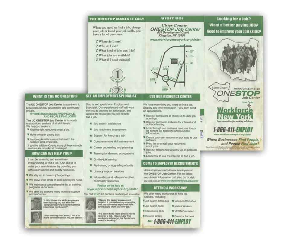
- BEFORE: Ulster County Workforce brochure design before redesign
The later [redesigned] brochure was laid out to have a primary point of focus for its readers. Centrally located in the cover panel is the newly introduced logo. With a strong yellow color like that of a traffic sign, “Ulster Works” commands attention. From the cover to the inside a logical flow to the graphic elements and text.
